Print, Packaging & Collateral
Brand strategy meets the tangible. Every piece is designed to feel considered — whether it's on a shelf, in someone's hands, or leaving an impression long after the moment has passed.
01
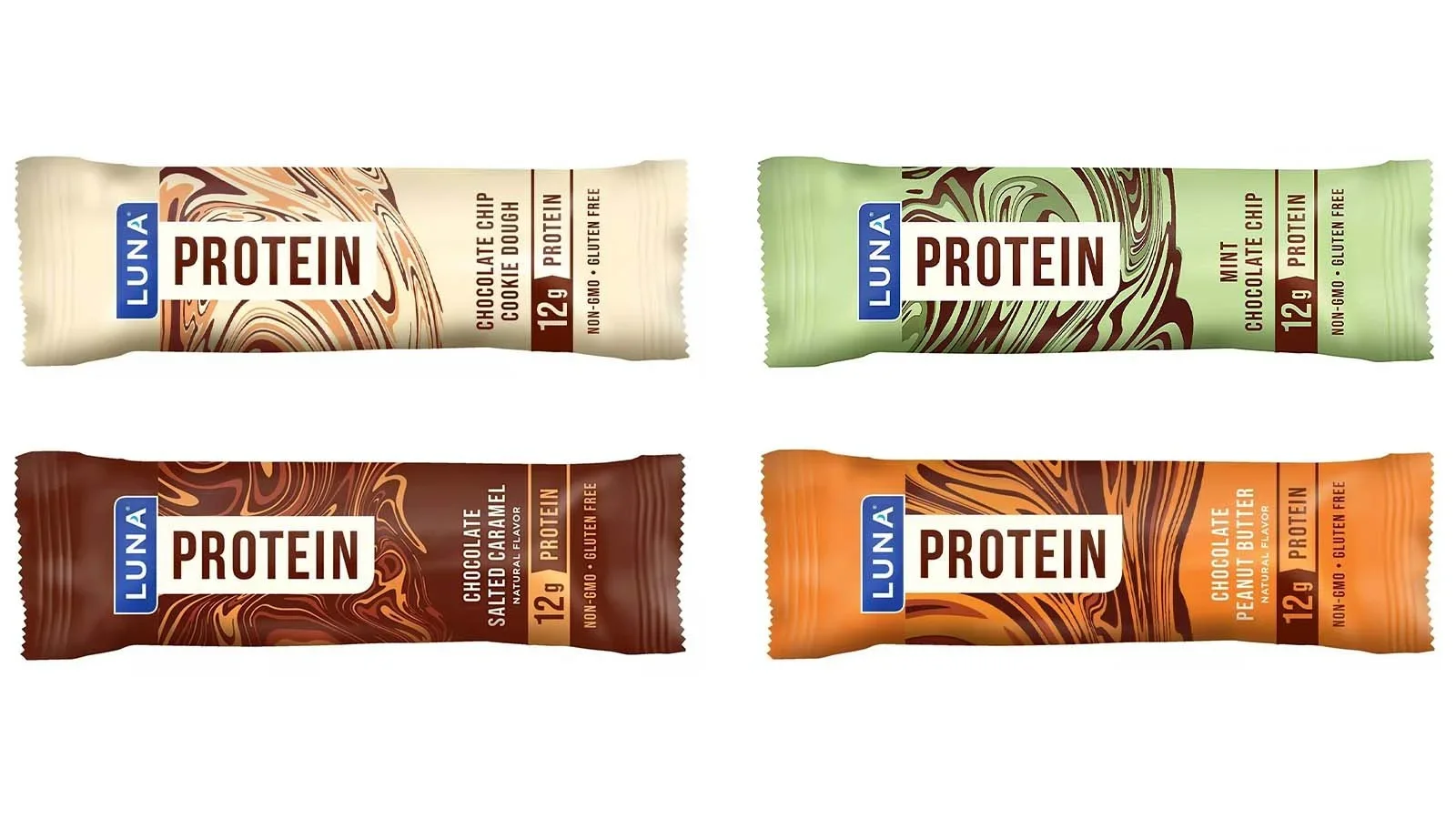
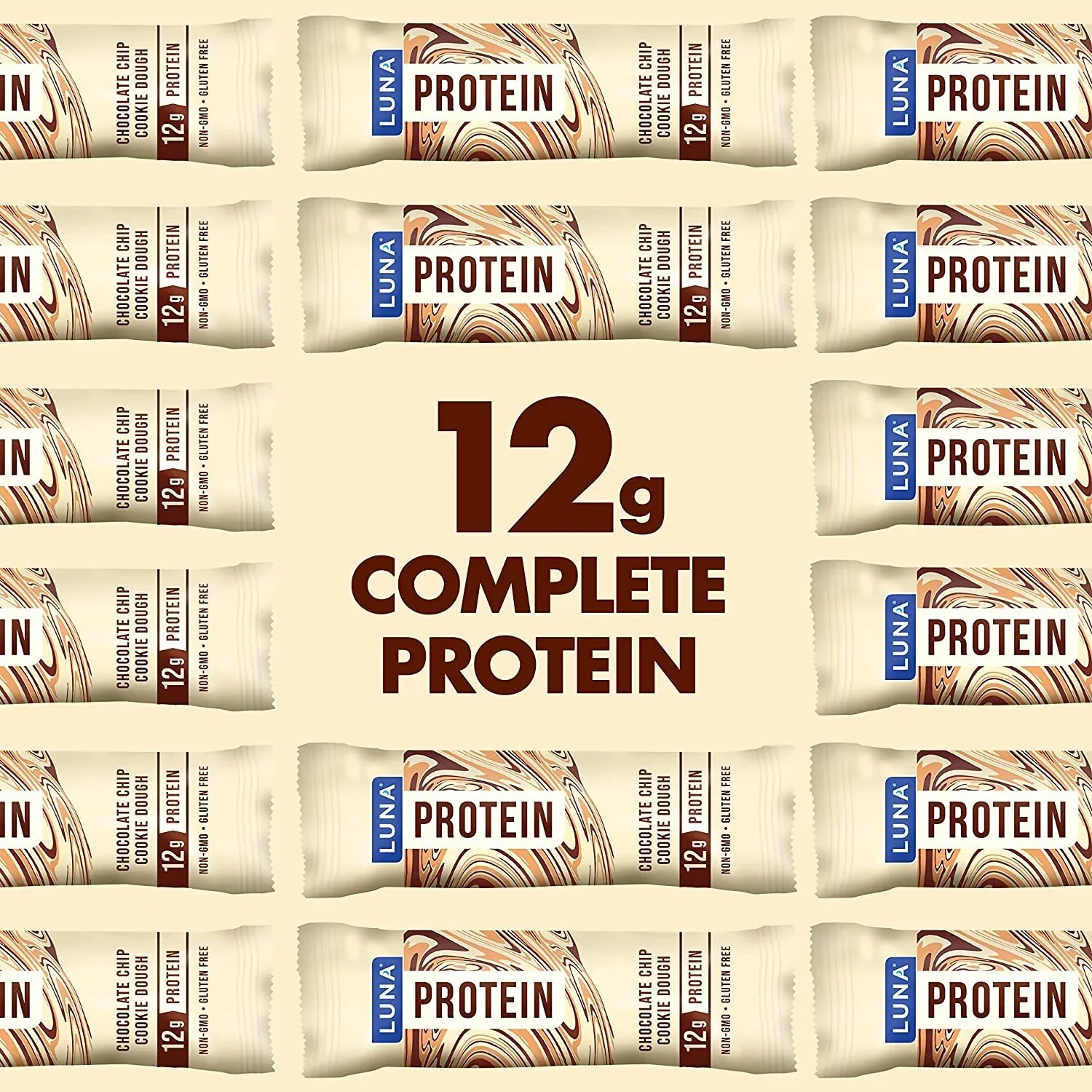
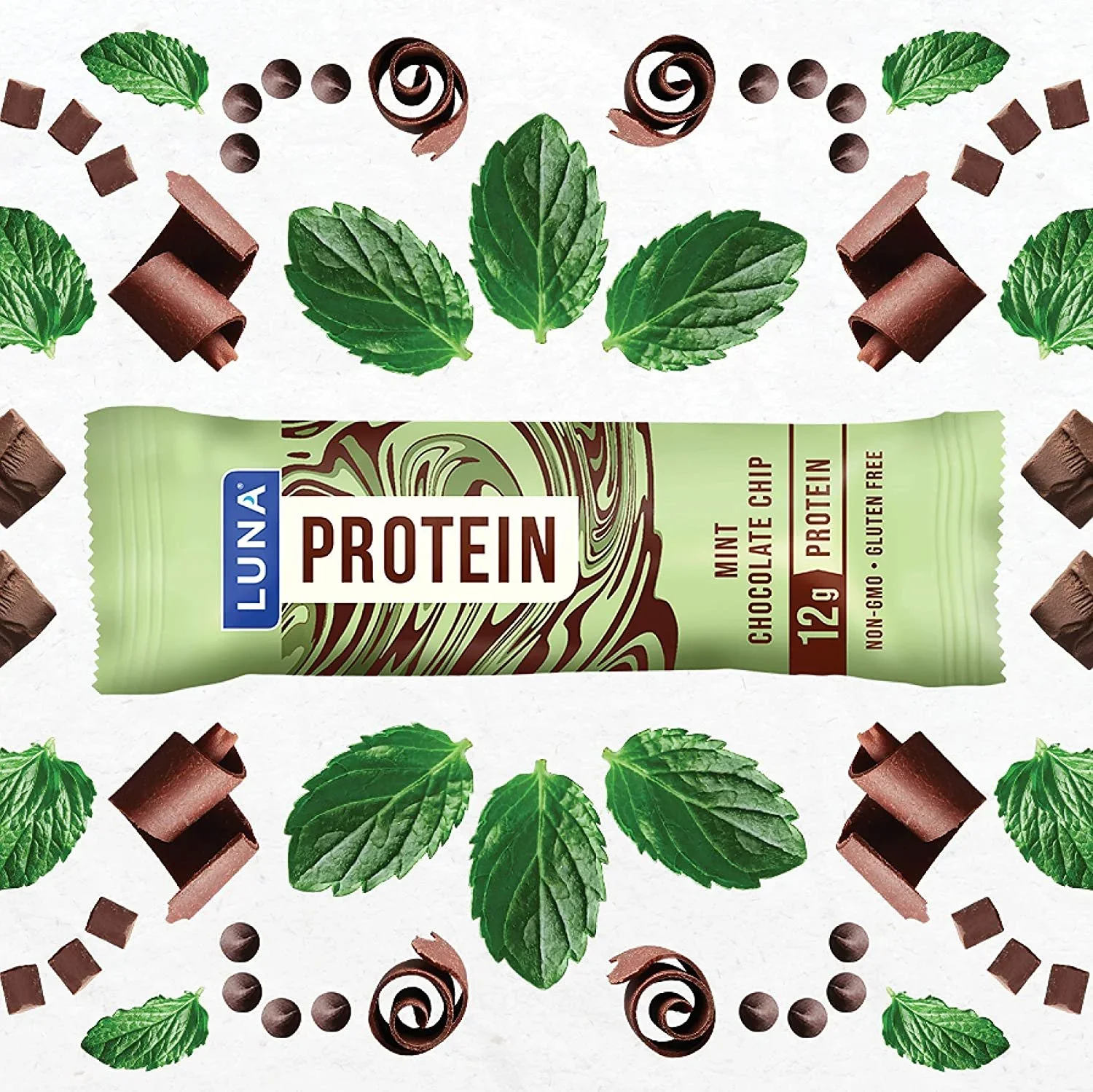
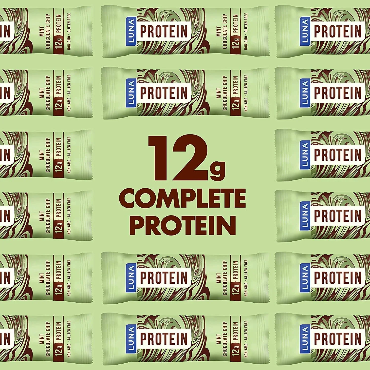
Luna Protein
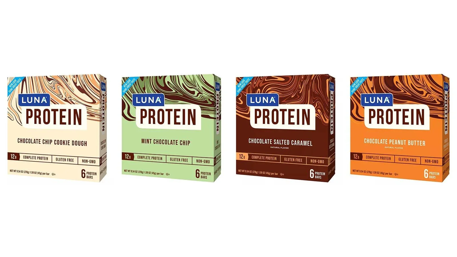
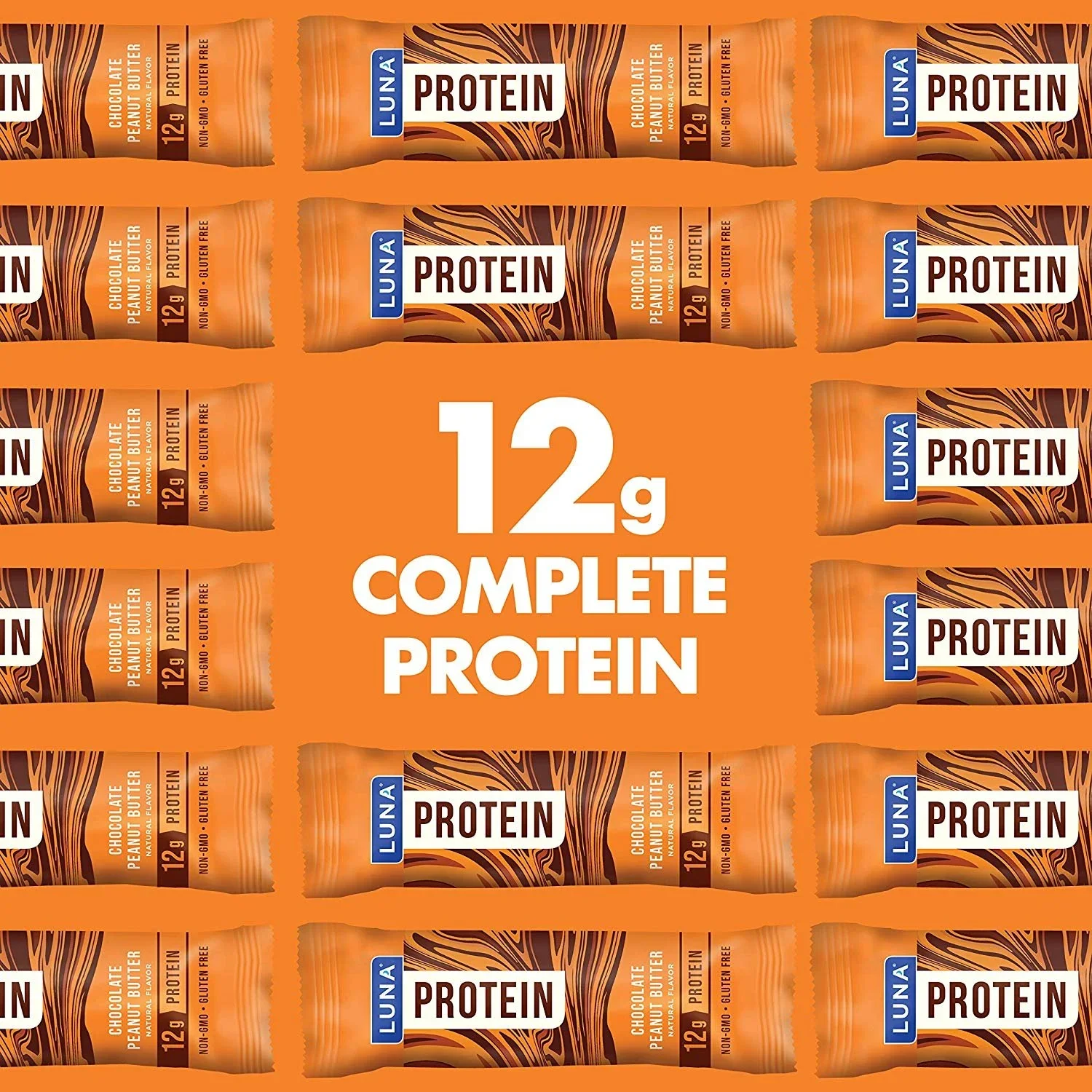
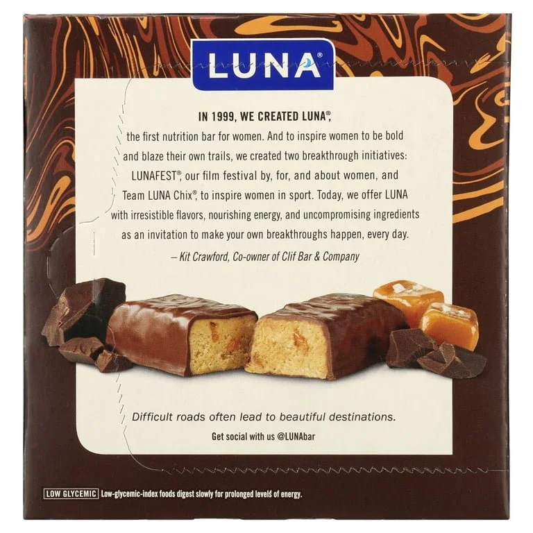
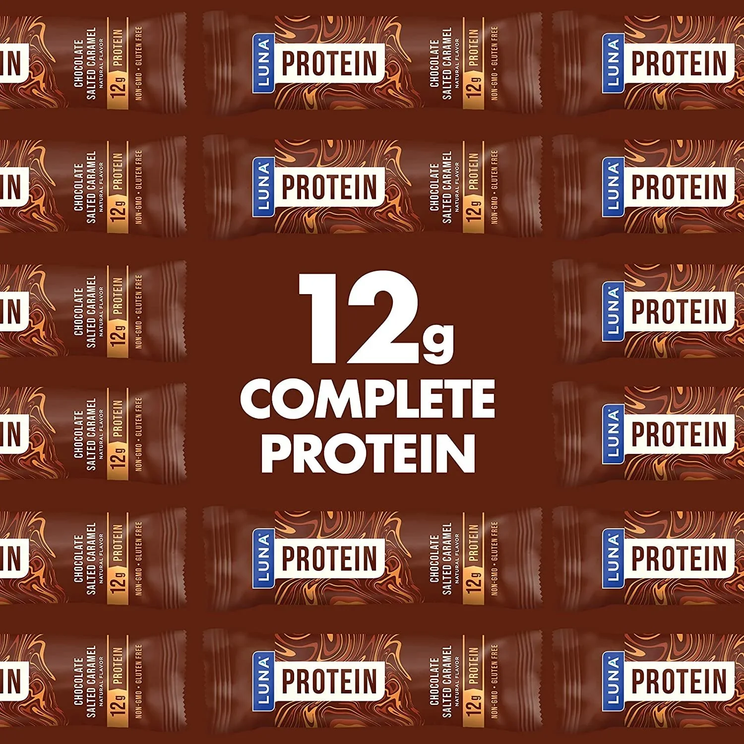
A packaging rebrand for Luna Protein Bar developed at Clif Bar — the goal being to modernize the design and reclaim shelf presence in an increasingly crowded protein bar market. Working within a small team, the work spanned multiple concepts, a logo-lockup redesign, and the final packaging direction.
02
Basically French Book Proposal
A full book proposal design for Chef Lindsay Kinder of Food La La — a cookbook and food memoir rooted in her six-month journey through France learning to cook from locals. The layout was built around her brand: clean black and white with copper accents, reflecting the female-owned, warmly personal aesthetic she's known for. The proposal includes everything from chapter design and sample recipes to photography and marketing pages — designed to feel as considered as the book itself.
Project assets are under NDA — happy to share more over a conversation.

Photography: Erica Garlieb03
Promotional Whiskey
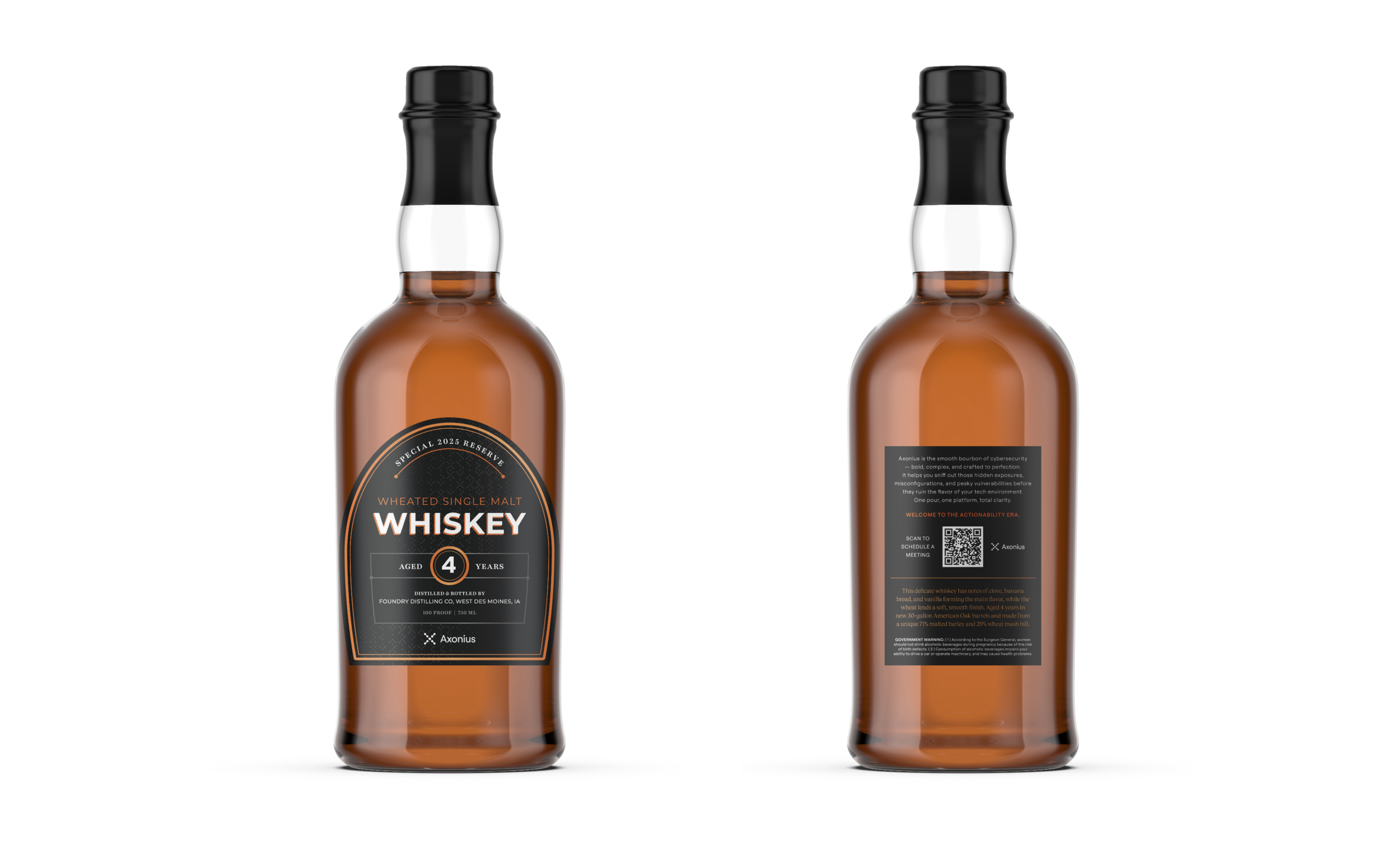
A custom whiskey label designed for Axonius's "Bourbon & Blazers" executive mixer — a networking event for cybersecurity and IT leaders. Axonius brand elements were woven into a refined, upscale label aesthetic, with copy that channeled authentic bourbon craft while staying true to brand messaging. The final piece was embossed and foil-stamped, giving it that extra tactile detail that makes a takeaway actually worth keeping.
04
Axonius Asset Cloud Product Booklet
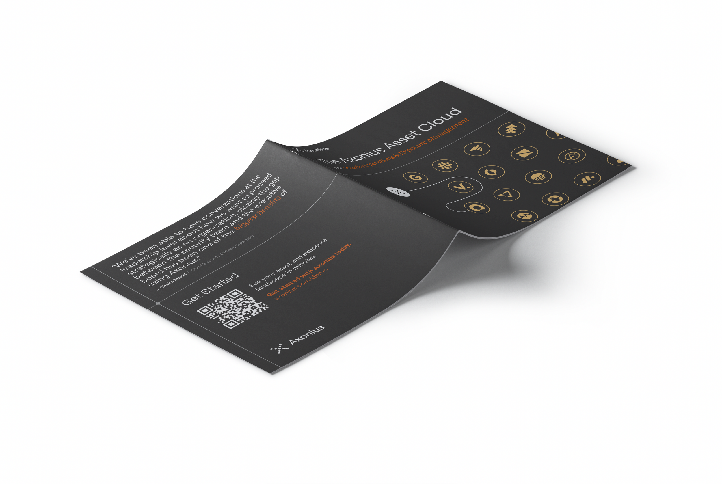
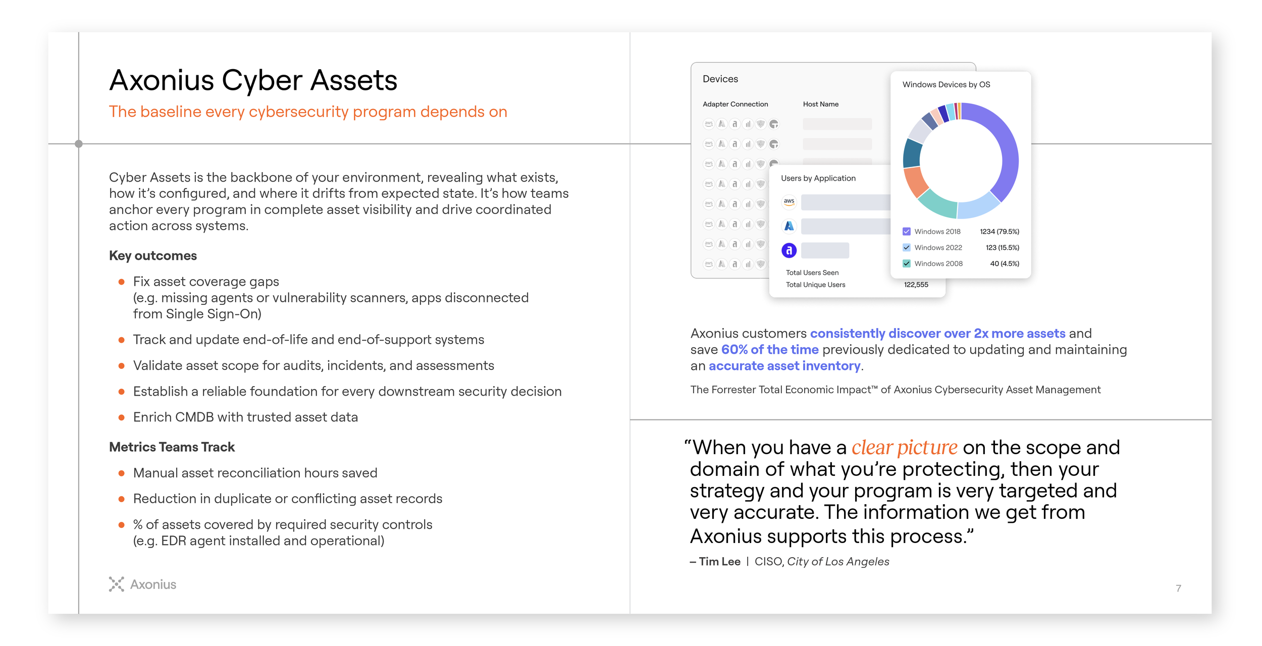
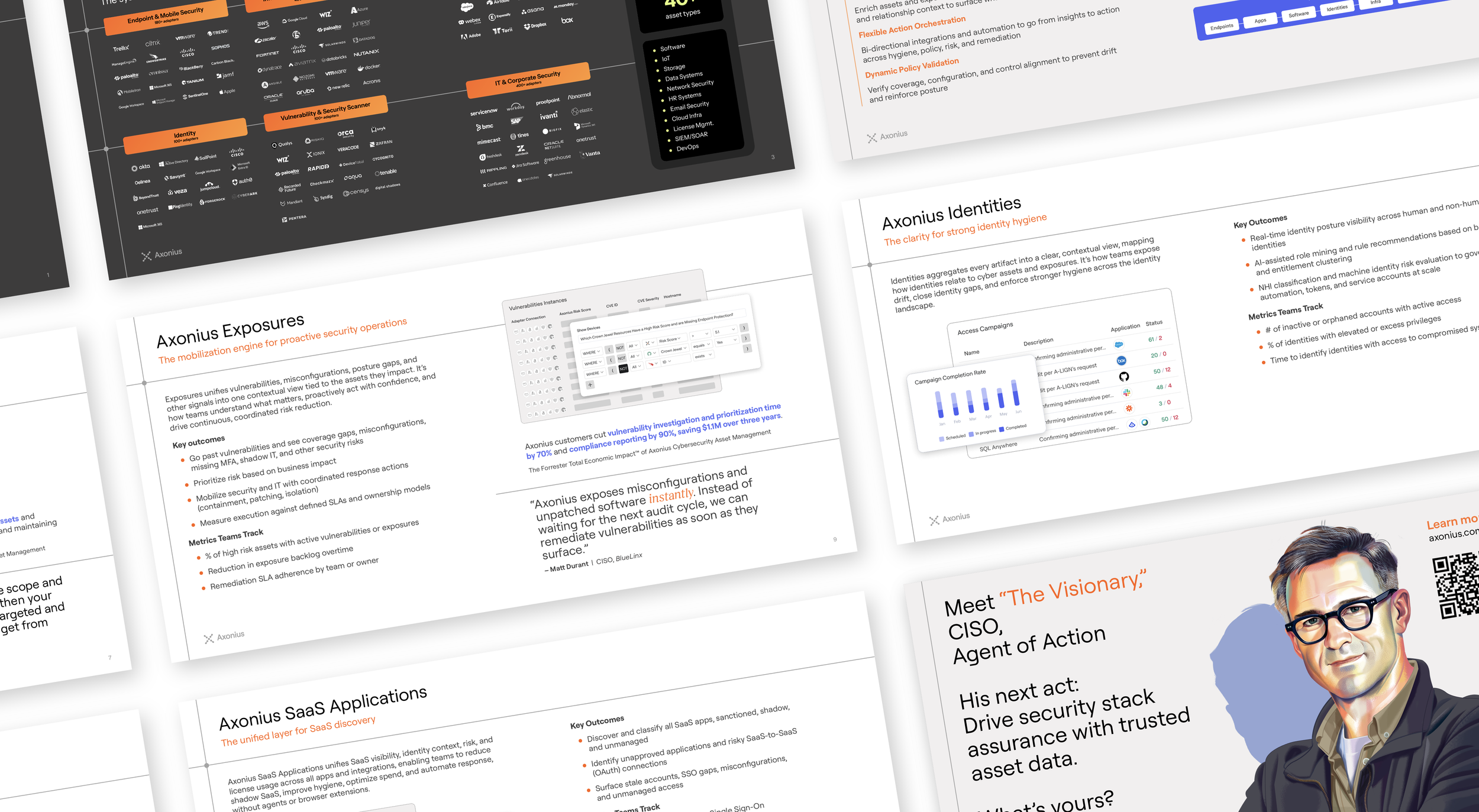
A 6x6 printed booklet designed as a more considered alternative to the standard one-pager — covering the Axonius Asset Cloud platform, its product modules, and the current customer campaign in a format that could travel from event floor to sales follow-up. The design balances product depth with brand presence, walking readers through the platform's full scope without losing the visual rhythm of the brand. What started as an event takeaway became a repeatable content format used across channels.
05
Zeals Sales Collateral
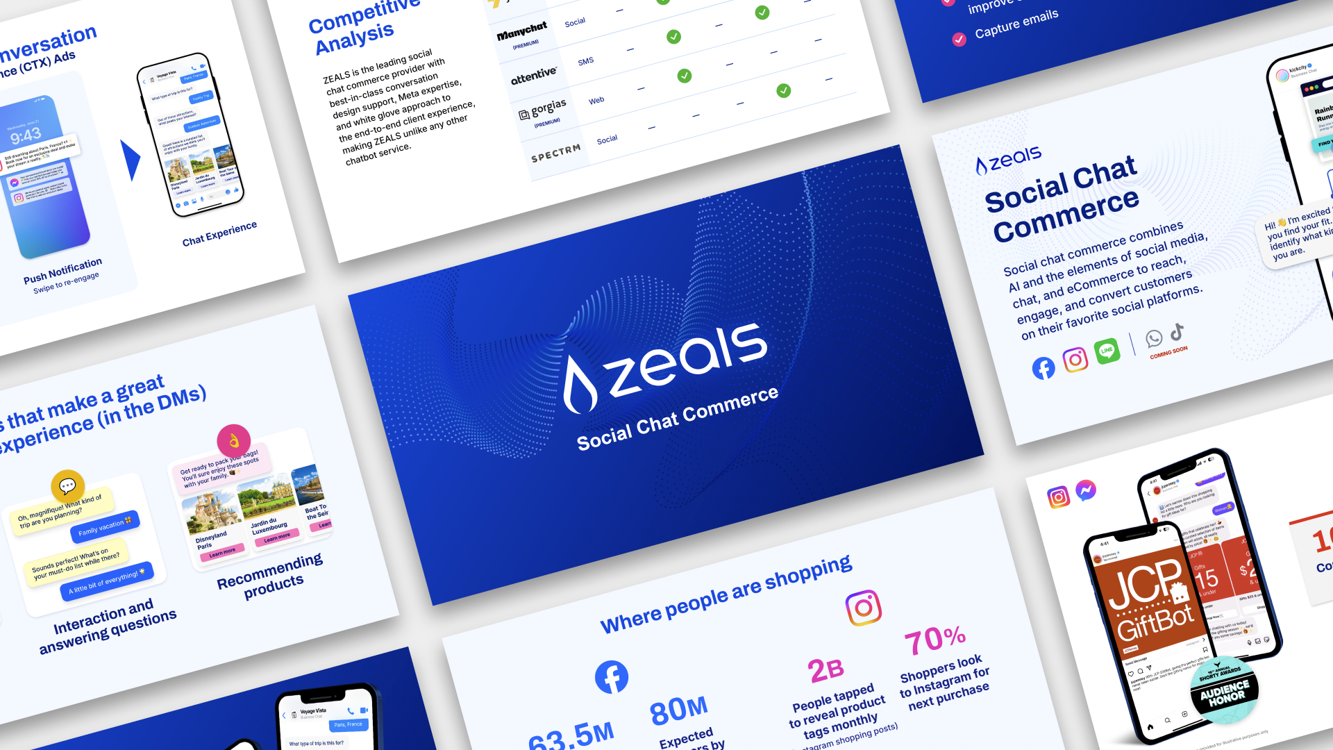
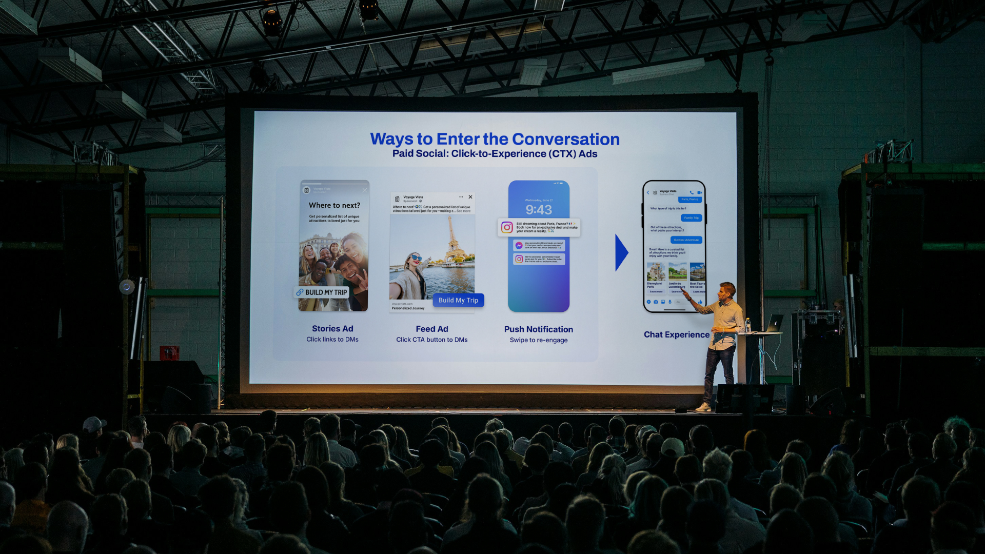
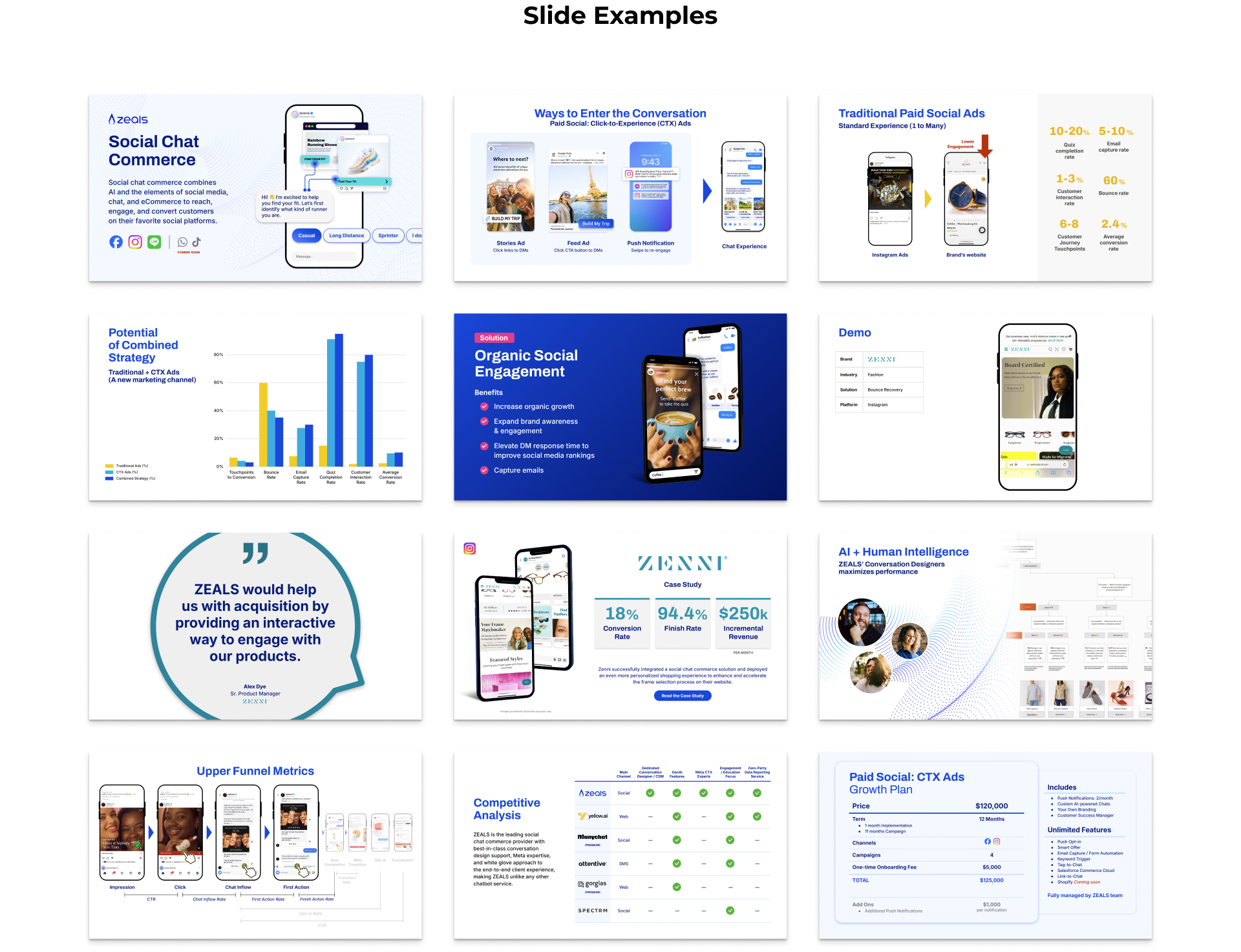
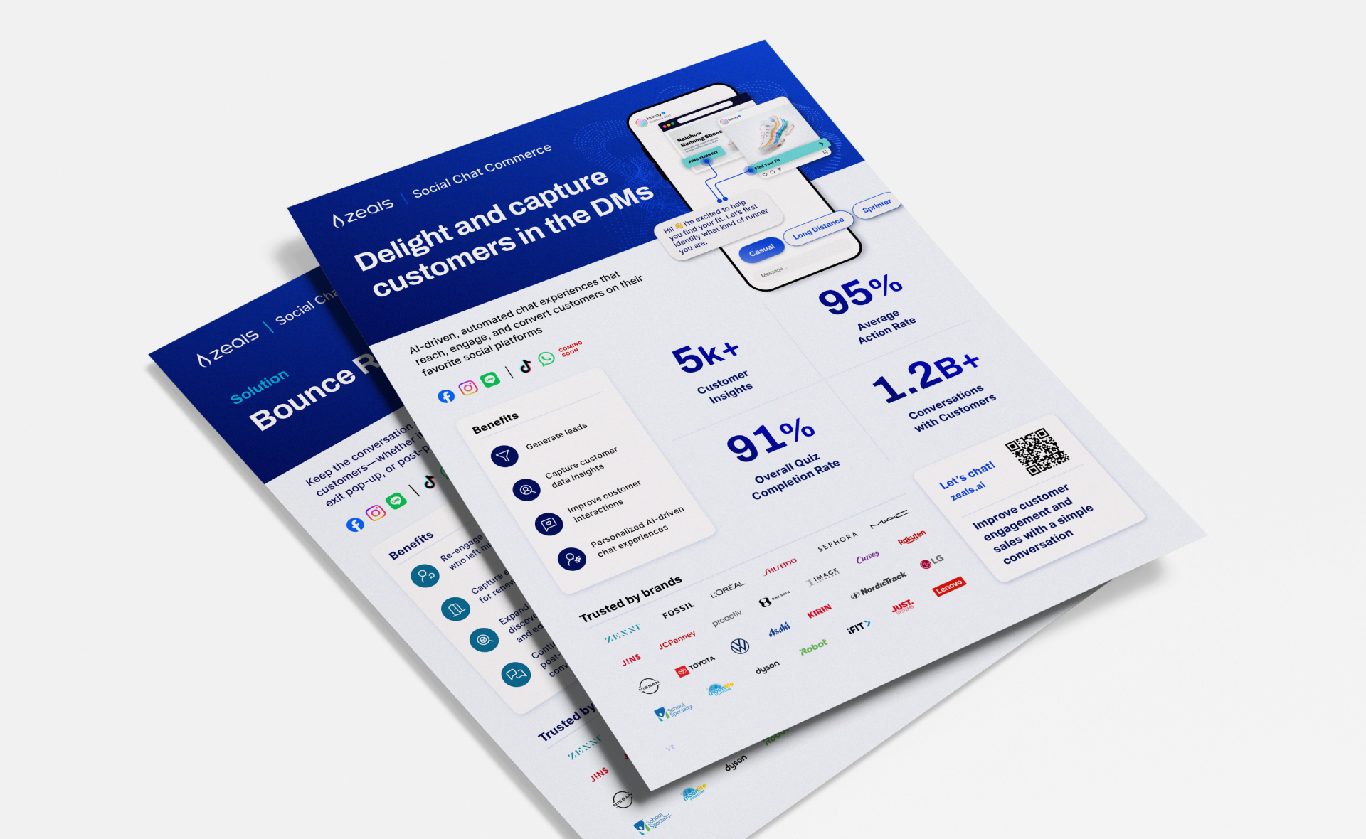
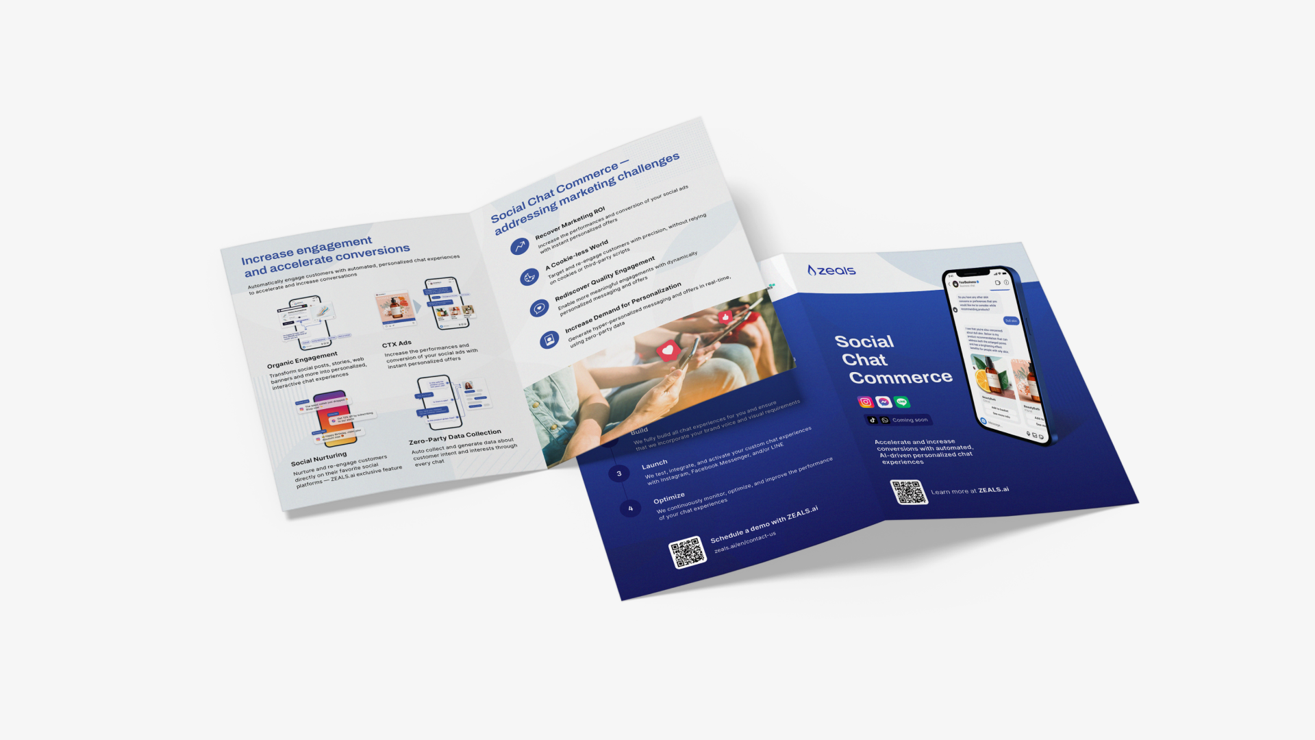
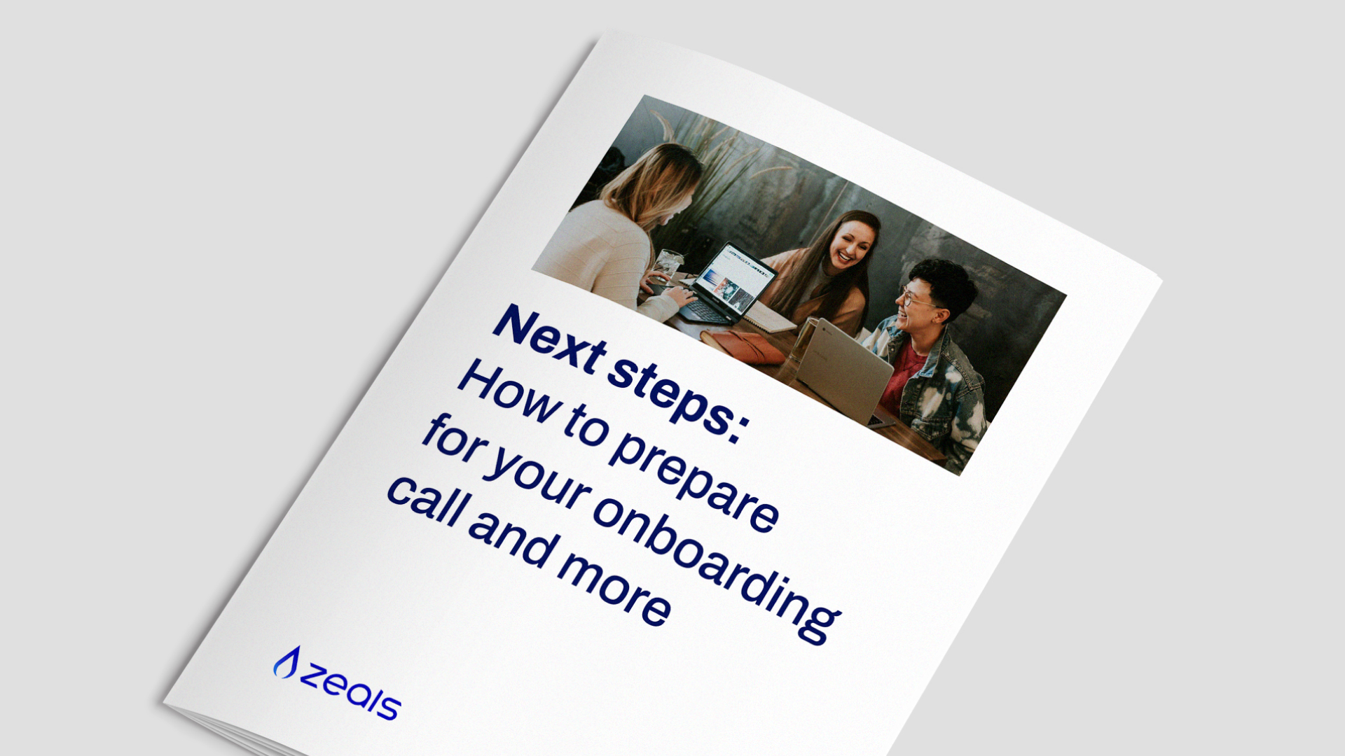
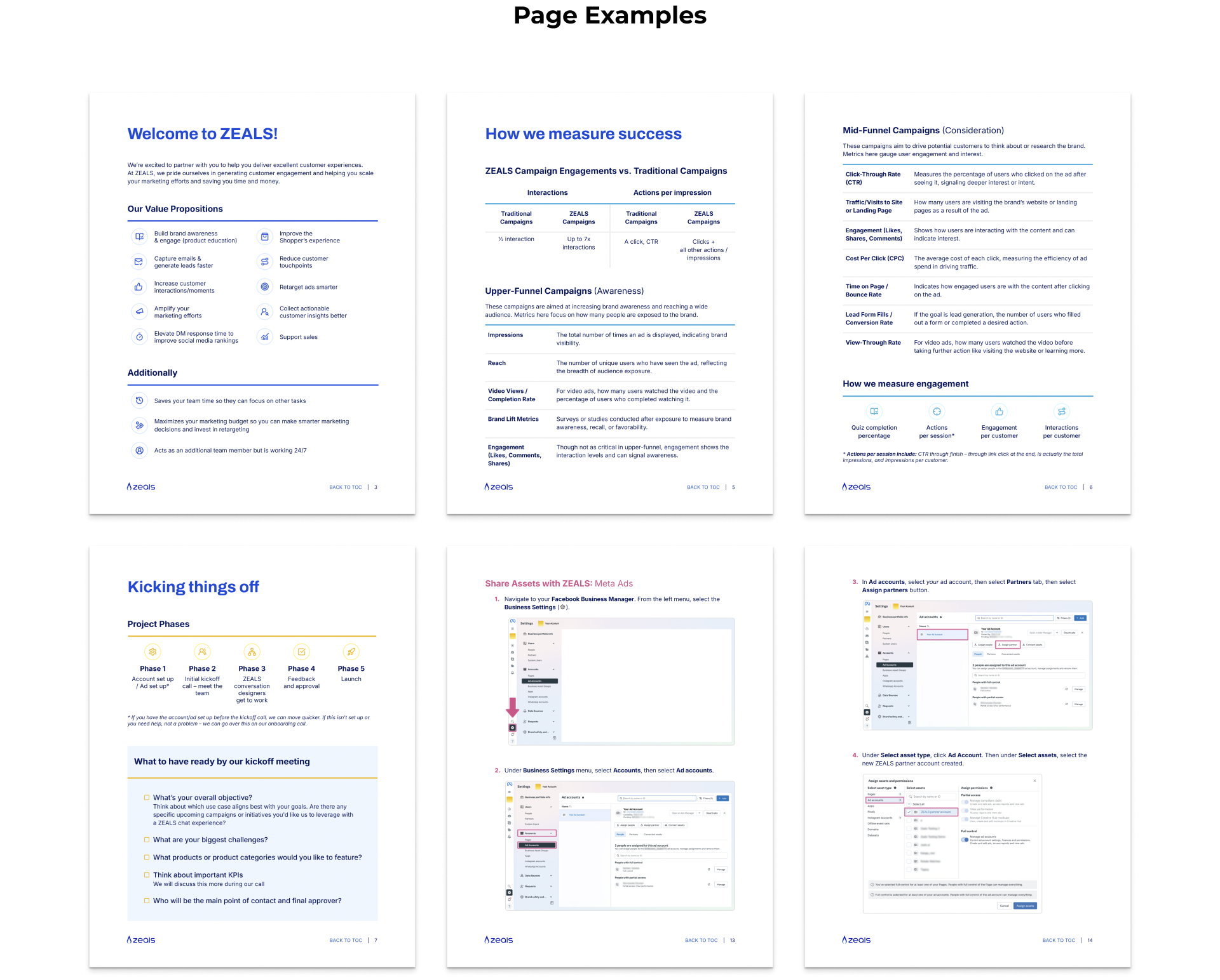
From sales decks to one-pagers, this work focused on making sure every piece of ZEALS' collateral communicated the brand clearly and moved the needle. The master sales deck was restructured to tell a more cohesive story — built as a foundation the team could adapt for individual clients, with animations and branded visuals layered in for major presentations. Alongside it, a suite of one-pagers was developed for sharper, faster sales conversations, with clear storytelling and a visual hierarchy built to land.
The result: a 31% increase in demo request bookings.
Let’s chat
maritessdesiderio@gmail.com